Wednesday, December 14, 2016

UAS and Pix4D

  • Look at Step 1 (before starting a project). What is the overlap needed for Pix4D to process imagery?
Recommended frontal overlap is 75% and 60% side overlap.

  • What if the user is flying over sand/snow, or uniform fields?
The recommended frontal overlap is 85% and side overlap is 70%.
  • What is Rapid Check?
Faster low resolution image of the data to determine how good the dataset is.

  • Can Pix4D process multiple flights? What does the pilot need to maintain if so?
Yes multiple flights can be processed.  The pilot needs to maintain a steady height so the imagery matches up.

  • Can Pix4D process oblique images? What type of data do you need if so?
Yes oblique images can be processed.  The data needed is terrestrial, nadir, or aerial oblique images.

  • Are GCPs necessary for Pix4D? When are they highly recommended?
They are not necessary, but they are highly recommended when processing an image with no geolocation.
  • What is the quality report?
The quality report is a file that shows all of the errors and how successful the processing was.  In this case it was orthomosaic and DSM imaging.

Introduction
Pix 4D was a very simple software to use.  With that being said there are many different things that can be done using this software.  Geocoded points were captured in the aerial photos.  In this lab the students created an orthomosaic.  Some of the other features this software has are creating a flyby video showing the mapped area in 3D in an aerial view.  This software also has the option to calculate volumes (Figure 1).  This can be very helpful in mapping sand piles at mines.  Once the images are created there needs to be enough overlap so that the images can be processed (Figure 2).  Once there is enough overlap the images can be processed.  The software was used to make a 3D map of a sand mine.

Figure 1:  This image shows a sand pile with a calculated volume.  The calculated volume is 1227.16 cubic meters of sand.  This also accounts for error adding a value of plus or minus 17.88 cubic meters.


Figure 2:  This image is a snapshot from the Pix 4D online tutorial.  This image shows when there is enough overlap in the points to run the data set.

Methods
The images that were given to the class were many different images of a sand mine.  There are 68 different photos taken.  This amount ensures that there is enough overlap for this software to work.  In the first steps the class ran an initial processing tool and received a quality report (Figure 3).  The next thing we ran was a point cloud and mesh.  This allowed the class to change output options.  It can increase density of the 3D points in the map.  The final thing we ran was DSM, Orthomosaic, and Index (Figure 4).  This allows all of the images to be tied together and a 3D image to come out as a result.  In calculating the volume of the sand pile, points were marked around the outside.  Since this data has a height value, the volume can be determined (Refer to figure 1).   Also with this software a polyline can be calculated.  A poly line is a line of distance measuring something on the map.  In this blog, the student measured the length of one of the trucks in the map (Image 5).  The distance of the truck was around 12 feet.  In the data set, the polyline length was just under 4 meters. 
Figure 3:  This image shows the first page of the quality report.  This report tells the user what worked well and what didn't.


Figure 4:  This image shows the steps taken by creating the 3D map.

Figure 5:  This image shows the polyline that was collected.  The student wanted to measure the length of the truck.  There is some error as seen in the image, but it was fairly close to what is to be expected.


Conclusion
This assignment was used to get the students a background in Pix4D.  This process was much simpler than doing some of the topography assignments that were done in the past.  Now that the students have a background in this software they can use this as they get jobs in the future.  This type of mapping makes measuring topography much easier and it also goes much faster. 


Tuesday, December 6, 2016

GPS Topographic Survey

INTRODUCTION
In this assignment the class used a survey grade GPS to mark points in one small area on the University of Wisconsin-Eau Claire.  The GPS unit that was used, is accurate to a sub-meter.  The certain GPS that was used for this assignment was even accurate to within one millimeter.  This means that the points gathered were extremely accurate.  The points gathered were on a small hill giving the points very different elevation values.  This data for each point was placed into a text file which the students then imported into ArcGIS.  When the table was moved into ArcMap the students then made points from the XY data in the text file.  With these points the interpolation methods were then used to show the overall elevation of the location.  The interpolation methods that were used were Spline, Nearest Neighbor, Kriging, IDW, and a TIN was created (Figure 1).  (For definitions of these methods, please refer to the sandbox survey Blog post).

Figure 1:  This map shows the final product of all maps in one.  This shows the differences in the maps.  

METHODS
The data collection used an extremely accurate survey grade GPS unit, although the class ran into some minor difficulties about 20 points were still collected.  The way this area was surveyed was a random sample.  Students took the GPS unit and took points from where ever they saw fit.  This would be the best way to take a survey with nearly 20 people.  Everyone can go where ever they like and take a random point.  This also gives the students control of where they think more points should be collected.  The survey would become more accurate if more points were taken on the sides of the hill slopes.  The survey data was put into a text file.  From the text file the data was copied into excel to make a file that could be imported into ArcMap.  After the excel file was imported into arcMap the points were created using XYZ data where longitude is the X value, Y is the latitude value, and Z is the height or elevation value.  Then the interpolation methods were run to come up with the final maps.

RESULTS
According to the results more points should have been gathered around the steep sides of the slope.  In the results of this map the Natural Neighbor map came out the best and most accurate (Figure 2).  This is because of the smoothing that occurs between the different points.  This makes the map smoother and flow better.  There is much more flow in the Natural Neighbor than there is in the Spline (Figure 3) and also with the IDW (Figure 4).  The Tin image (Figure 5) shows very rough cut edges and no smoothness almost resembling a mountain.  This is obviously not accurate in this situation in the middle of the UWEC campus.  The Kriging is probably the second most accurate in this situation.  The only thing is that the hill comes to a crest and seems on the south western side to never slope back down to the sidewalk (Figure 6).

Figure 2:  This map shows the Natural Neighbor interpolation method.  This is the most accurate of the maps created.  It shows very smooth moving from point to point.

Figure 3:  This map shows the Spline method of interpolation.  This method showed the very large white portion meaning the elevation was highest here.  This map has the most white in any of the images.

Figure 4:  The IDW method shows precisely the opposite of the spline.  This map shows the smallest area of white.  This means that when the ground is only this high for a very small area.

Figure 5:  The TIN image shows the very rough areas.  This image abruptly goes from one elevation to another.  This image almost resembles a mountain.

Figure 6:  The Kriging Method shows the second most accurate of the maps created.  This is easy to see that the map very slowly and fluidly increases in elevation from the northeast to the southwest corners of the map.

CONCLUSION
These methods were the same ones that were used in the sandbox survey with different results.  This is most likely due to the fact that different survey methods were used.  The spline method produced the best looking map in the sandbox survey.  With the sandbox survey a very uniform method of sampling was used.  A point was taken at every cross in the grid pattern.  Where as in the GPS topographic survey a random sample was taken.  This could also be partly due to the fact that the class was working as one in the GPS survey rather than small groups as they were with the sandbox survey.  These maps could be much better if a stratified or a systematic sample.


Tuesday, November 29, 2016

Arc Collector Part 2


Introduction

In this assignment the students were to come up with a research question and create different attributes to answer their question.  This blog looked to answer Which park in Eau Claire would be the best to host an outdoor basketball court?  This project arc collector was used.  All of the attributes collected were put into ArcGIS online and then exported into ArcMap to allow this data to be modified.  Some of the attributes that were considered were whether or not the court had lights, how many courts, the type of playing surface, the type of rim, the type of net, whether there is a shelter present, and whether or not there is a parking lot present.  Many people like playing basketball so this question was proposed to determine the best place to host a tournament.  This would allow for people to pay and play in a team for a cash prize or to raise money.   Basketball tournaments can be a great way to bring people together for a good time and this looks at the best location for that to occur.  The area of study was the city of Eau Claire and parks within the city (Figure 1).  The attributes were only collected for parks and not playgrounds of schools within the city.

Figure 1:  This image shows the location of the points collected.  The image shows how the parks are all located in a circle around campus.  The two points in the center represent the two different sets of basketball courts on campus.


Methods

The points were all collected using ArcGIS online.  Once a button is clicked all of the attributes to be included for that specific point popup and are allowed to be filled out.  This application is very simple once it has been done before.  The different attributes that the student included to answer their question were parking lot present, number of courts, playing surface, rim type and net type.  The more important of these attributes are the number of courts and playing surface.  Many players like to play on asphalt as opposed to cement.  This is due to the fact that slipping often occurs with cement playing surfaces.  All of the courts plotted except two had asphalt as the playing surface.  The next most important of the attributes was the number of courts.  This is a very important attribute due to the fact that more games can happen at once.  If there is only one court potentially two half-court games can occur at a time.  If there are more courts, obviously more games can occur.  Another of the attributes was rim type.  Many outdoor hoops, including all of the data points, have double rims.  This is due to the fact that many of these hoops get abused in the elements and by people dunking on them.  The double rim is to add support to make the hoop last longer.  The double rims can cause a problem though because this makes the rim extremely stiff and if the ball hits, it usually flies off resulting in a miss and long rebound.  Many people prefer to not play with double rims, but nearly all outdoor courts have them.  These attributes along with whether parking lots are present, types of net, and whether or not a shelter is present, could all be key in determining whether certain areas would draw teams.  

Results

The data that was collected included whether a parking lot is present, whether a shelter is present, the type of rim, the type of net, and what kind of surface the court is on.  These attributes can be major draws for teams to come to an event like this.  11 areas were explored.  11 had nylon nets and 11 had double rims.  9 of the 11 had asphalt courts (Figure 2). 9 Areas had shelters and only three have parking lots.  The two locations on campus were the only ones that had more than one court present (Figure 3).  With all of the attributes collected, the best place to host a tournament to get the most games done, most accessible, and an asphalt playing surface would be the locations on UWEC's upper campus.  These two sets of courts are so close together that they could have games going on both of them.  This would mean five courts would be open and potentially 10 games can occur at one time.  Figure 4 is an embedded map that was created using ArcGIS online and it gives the reader full control.  It allows to zoom in and out, and the points are interactive.  If the points are clicked on, it shows the attributes attached to that particular point.

Figure 3:  This map shows the locations of the different playing surfaces.  As can be seen, the majority of the points have asphalt for the surface type.

Figure 3:  This map shows the locations and the number of courts at each.  This is a proportional symbol map giving locations with more courts a larger symbol.  Most of the courts here, except the two on campus have only one court present.


Figure 4:  This interactive map shows the areas that were recorded and the number of courts tied to each location.  All of the points that were collected besides the two on upper campus had only one basketball court.  Campus is right in the center where the larger black points are located representing the higher number of courts.

Conclusion

What this study found out was that the two courts on the UWEC upper campus would be the best to host tournaments.  With this location, there are 5 courts very close to one another.  Another draw to this location is the amount of parking space.  This location was also the only court to contain lights.  This means that 10 half-court games could be going on at one time.  This also means that the games could go into the night and the courts would be lit so teams could continue playing.  One drawback of this location is that there are no shelters around the courts.  There is also no playground for kids to play on.  All other locations recorded only had one full court.  All courts had nylon nets and double rims.  And all courts except on campus have playgrounds and would be more child friendly.  If this project were to be considered again, schools could also be considered as viable locations to host basketball tournaments..    

Tuesday, November 15, 2016

Microclimate Lab

Introduction
In this lab a Kestrel unit was used (Figure 1).  This tool measures wind speed, temperature, dew point and a few other things regarding weather.  In this lab, the class was split into eight different groups.  These groups went to different areas around campus marked out by a map (Figure 2).  I was assigned to zone one.  This included the footbridge and the area on the Water St. side of campus.  There were five different zones that groups were to take data points and measure wind speed, wind direction, temperature, and dew point.  The data points were collected and the attributes were typed in using arc collector.  This software allowed the class to all record their data points at the same time.  As groups were looking at their maps, other points from other groups were popping up all over the place.  This was very interesting to see where other groups were taking points.

Figure 1:  This is the Kestrel unit that was used to collect the attribute data (temperature, dewpoint, and wind speed) at each point.

Figure 2:  This map shows the different zones in which data was collected.  Zone four had no group so there is no data for zone four.

Methods
At each point on our phones we were able to hit a button that said mark point.  This then allowed the students to type in the attributes at each point.  The attributes were wind speed, wind direction, temperature, dew point, and there was a place to put notes.  Group one even attached an image to one of the points collected.  This data was collected using arc collector in ArcGIS online.  This made the data very easy to export into ArcMap allowing us to create specific maps based on these attributes. 


Results
This exercise was great for making the students work together in coming up with a process in gathering the data.  There were no real patterns besides the fact that when we were close to the river the wind always came from in the river valley.  There were times at points we collected that there was no wind.  Another thing we noticed was that when we were closer to the water the temperature was higher than it was around other parts of zone one (Figure 3).  This surprised me.  I assumed that the temperature would have been cooler around the water.  The dewpoint data that was collected was very similar to the data that was collected for temperature (Figure 4).  The same trends that were seen with temperature were seen with dew point.  The wind speed shows that many of the points the wind was almost non existent (Figure 5).  This tells us that the wind was not really blowing and many of the students had no data to collect in places.  

I chose not to include my wind direction map as after discussing with groups it sounded as though we had different methods of collecting this data.   

Figure 3:  This map shows the different temperatures that groups collected around campus.  As you can see in zone one the closer the point is to the river the higher the temperature.

Figure 4:  This map shows the data for dewpoints around campus.  This map correlates to figure 3 showing the temperature.

Figure 5:  This map shows the wind speeds of the points collected around campus.  There were many of these points that had no wind data to collect.

After these points were transferred into ArcMap the attribute data was tied to each point (Figure 6).  This data was included when the points were collected.  The attributes included temperature, wind speed, wind direction, dew point, and extra notes.

Figure 6:  This image shows the data that was collected for each point.  This is the attributes for one specific point gathered by group one.

Conclusion
This lab did a great job in showing students that there are easy ways to collect data.  This data is then easy to put into ArcMap to be worked on.  This makes life much simpler for people to do what they want with the data.


Tuesday, November 8, 2016

Priory Navigation Maps


INTRODUCTION

In the previous lab the groups constructed navigation maps to use at the Priory Nature Center.  The maps that were created were used to find points that had been hidden in the woods.  We were armed with only a GPS unit and a compass tool.  Using these tools the groups were able to navigate to 5 different sets of points.  I was included in group 1.  We moved along quite well finding our first point quite early.

STUDY AREA
Our study area was at the Priory nature center.  This area is owned by UWEC and used to house students.  It is just a few miles south of Eau Claire.  This area is surrounded by thick forest areas.  The study area was full of ravines and hills the locator map that we used showed all of this in the contour lines.  There were times that we thought according to the map there should have been hills, when in fact the contour lines were showing us we were looking at a ravine.  We collected our first point quite effectively (Figure 1).

Figure 1:  This was us having a little fun with the first point that we discovered.  We got to this one quickly after we started.


Figure 2:  This was the third data point that we collected.  This image shows that the ribbon was not on the tree and actually on the ground.  This point was difficult for us to find.

POINTS

We did get to all five of the points that were given to us.  We took not the best track that we could have (Figure 3).  It was also very interesting to see how all of the different groups crossed paths as many times as they did (Figure 4).  We never actually saw one of the other groups, although we did hear them.  We knew that we were close to other groups, but we never saw them.

Figure 3:  This map shows the track that our group took and shows that we crossed over our own path multiple times.


Figure 4:  This map shows the different tracks of all the different groups.  Group 1 crossed over three other groups tracks.  This was very interesting since we never saw another group.

METHODS

The tools that we used were our locator maps, GPS units, and compasses.  We used the compass to find angles to direct us to the next points on the map.  The tools helped us in finding the points accurately and decently quickly.  We were the second group to finish.  


CONCLUSION

Our group worked very well together.  We all took our turns using the compass and GPS units.  This was very effective in creating a relationship within the group.  This make trudging through the briar bushes.  I was dressed for the part, however one of our group members did not have the correct kind of shoes on for this activity.  We made it work.  The terrain was tough to get through a few times, but everything worked out for us.  The point we struggled the most to find was point three.  We passed this point on 3 separate occasions before we finally found it.  

Tuesday, November 1, 2016

Navigation Map (Creation)


In this assignment we created maps that our groups will use to navigate the woods through the Priory in Eau Claire Wisconsin.  The maps that were created used two different types of grids that will be used on our maps.  The grids that were created used two different styles.  The styles are UTM with 50 meter intervals (Figure 1), and Geographic coordinates using decimal degrees (Figure 2).  The two maps that were created could be used differently in different situations.  In my opinion the UTM grid will be more useful for this assignment.  The maps that were created needed to have plenty of deal but had to be balanced so that they was not too much going on making them difficult to read.

Figure 1:  The map shows the grid of the UTM zones.  From this image the labels are very difficult to read.  Included in the orange are contour lines, and the yellow box shows the area that we will be working in.

Figure 2:  This map shows the gridlines that were created using the decimal degrees.  This image is in a different coordinate system giving it the uneven look.


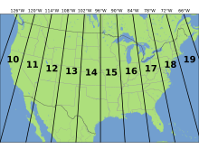
In figure 1 the coordinate system used was Nad 1983 UTM Zone 15.  This stands for Universal Transverse Mercator.  This system puts zones into vertical columns.  In this case Wisconsin is located primarily in zones 15 and 16 (Figure 3).  This coordinate system I believe will allow for a more precise map.
  Image result for utm zones
https://upload.wikimedia.org/wikipedia/commons/thumb/8/8d/Utm-zones-USA.svg/220px-Utm-zones-USA.svg.png
Figure 3:  This image shows the UTM zones for the majority of the United States.  Wisconsin is located in zones 15 and 16.


Figure 2 uses Nad 1983 Wisconsin TM (meters).  This is a state plane coordinate system.  This is a coordinate system just for that state.  This means that within that state the map could be extremely accurate, but the farther out you move the less accurate it becomes.  

I am very curious to see which of the maps that were created will be the one that is more helpful.  Precision is necessary and this exercise should be a great way to show which of the coordinate systems is more accurate.

Tuesday, October 25, 2016

Distance Azimuth Survey

Introduction

This lab we collected azimuth.  Azimuth is the angle from your origin point.  This means that some of the points collected had very high azimuth and some had very low azimuth.  This measurement can go up to 360 degrees.  In figure one each of the three origin points have all of the azimuth lines coming from it.  The origin points are all located in the center of the point sets.  Data was collected for ten trees from each of the three origin points. 

Study Area

The area that was surveyed consisted of three different points along Putnam trail.  From these different points, 10 trees were surveyed.  These ten trees we looked at distance and azimuth from our starting point, type of tree, and also the DBH (Diameter at Breast Height).  The group I was with took our points at the same point we started at as a class.  This would be the middle set of points (Figure 1).  This area was located at the bottom of the UWEC stairs. 

.

Methods

The data that was collected for each point consisted of DBH, Azimuth, Distance from starting point, and tree type.  This data was measured using a compass tool and lasers.  The lasers measured the azimuth and the distance from where you are standing.  There is a small lens that must be looked through and the crosshairs needed to line up on the tree you wanted.  This laser would then tell how far this tree is from the origin point, while also collecting the azimuth information.  The compass that was used had a small lens to look through to calculate the azimuth.  The students then had to measure the distance to the tree they were trying to plot.  This unit was more up to the student to find a precise measurement.

The data that was collected included X,Y coordinates for the origin, DBH, azimuth, distance, and the tree type.  This data was collected to show what attributes went to which point.  This also makes it easier to tell which tree is being shot.  As the person was shooting the point collecting the azimuth and distance measurements, another student was collecting the DBH data.  This was collected using a tape measure that took the circumference measurement and transferred this into a Diameter value.

Azimuth is very important for sailors and ships.  They use this same kind of data, but they use it in the sky and calculate azimuth from certain stars.  Some say that azimuth is like a horizontal angle measured around a fixed origin point in a clockwise fashion.  The benefits of this method are that not many tools are required.  Although this is true there is technology that can calculate azimuth much more accurately.

In creating the map some issues were encountered.  Two of the origin points were not in the right location.  This was overcome by recalculating the X,Y coordinates to put the origin in the correct spot.  Some of the issues we faced in the field were visibility.  There were times a student wanted to collect data of a certain tree but could not due to the other trees in the way.  To calculate different data points, another origin point would have to be created.               


Figure 1:  Map shows the three locations where the ten points were collected.  This data was gathered along Putnam trail and near the bottom of the campus stairs.  The cars are in the new Davies Center parking lot, while the track is behind McPhee on upper campus

Results

The data that was collected was accurate, except for the X,Y coordinates.  This data had to be played around with to get the points where they needed to be.  The coordinates of these points are not extremely accurate, which then makes the map inaccurate.  The map shows the representative distances to the trees that were reviewed.  If the origin was moved, the distance to these trees is off.  All the data was collected, but in the future we will need to be more careful to have this data be more accurate. 

Conclusion

This tool could be extremely beneficial to someone often sailing the seas.  It is not as important to me.  This is a very interesting way to find data.  This shows a very precise location of where you got the data that was collected.  Depending on the angle, you can tell which direction the data came from.  This method is very interesting, but somewhat impractical to me.